Fonts 101: How to Use Fonts Like a Pro
Fonts 101: How to Use Fonts Like a Pro (Even If You're Not a Designer)
"Make it easy to read." Roger Black, art director
For those of us old enough to remember life before computers - yes there really was such a time - there was the typewriter. Every document you typed out looked exactly the same: boring courier. Today, there are thousands of fonts to choose from even within Word.
The great thing about so many fonts is we can pretty up our documents and let our personality shine through. The worst thing about so many fonts is that most of us, who are not formally trained in design, don't know where to start. This becomes very apparent when looking at many parish bulletins or posters that have five, six, seven different fonts. 😱
The trick to pairing fonts is contrast with harmony.
The good news? You don’t need to be a graphic designer to make smart font choices. With just a few simple tips, you can elevate your parish’s posters, bulletins, and social media posts to look like a pro designed them.
Typeface vs Font
We Catholics are most familiar with the baptismal font. But there is another kind of font and it has to do with text.
But before we tackle what a font is we need to take a step back to consider typeface. A typeface is the overall design of a set of letters, numbers and symbols, e.g. Times New Roman, Arial and even Courier.
A font on the other hand is a specific version of a typeface, e.g. Times New Roman Bold Italic 12 point. These terms are often used interchangeably — and that’s okay. What really matters is knowing how to use them well.
Four Categories
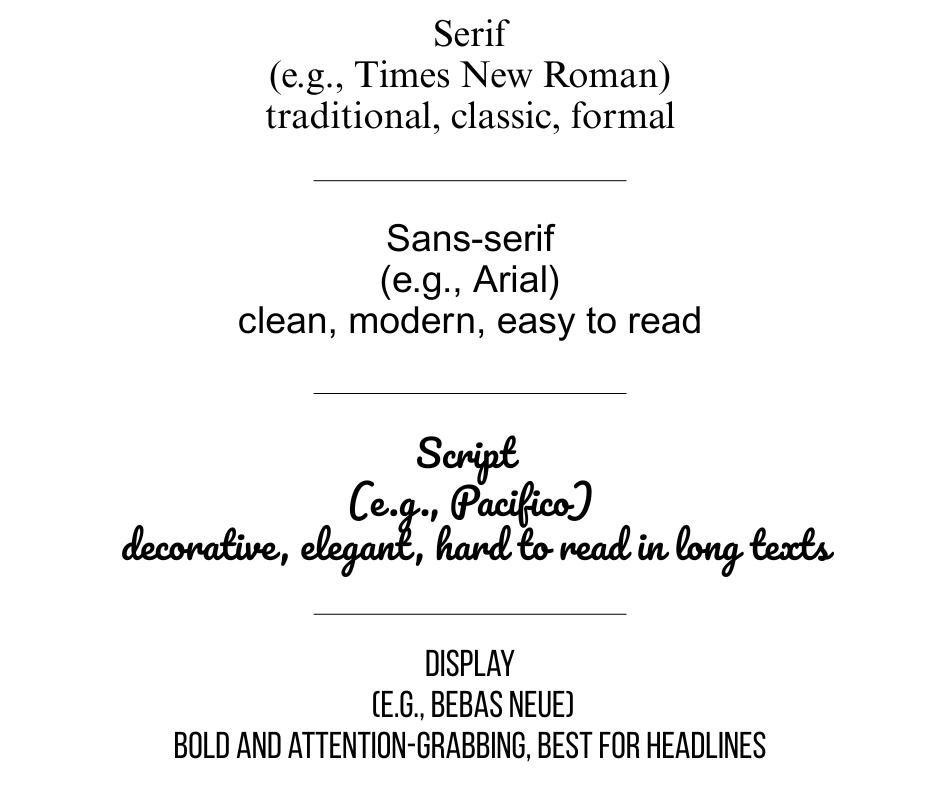
Essentially, there are four categories of typeface: Serif, Sans-serif, Script and Display. Knowing these categories helps you to understand what you are looking at when faced with a giant list of possibilities.

Why Fonts Matter in Catholic Communication
Most of us think that graphics are just photos or drawings, but fonts are also a type of graphic. In fact, you can create a poster or a social media post using only fonts.

All graphics help to shape how people experience your message. Think of them like liturgical music — the style you choose sets the tone.
A clean, well-paired font can make your parish newsletter feel warm, welcoming, and credible. On the other hand, a cluttered or overly stylized font can distract or confuse your reader — even if the content is great.
Stick to 2–3 Fonts
One of the most basic rules about fonts is "don’t use more than three fonts in one design." Trust me, less really is more. Despite all the self-learning I have done in this area, I know I am not a graphic artist which is why I always follow this rule!
Here’s a simple structure to help you know which 2 or 3 fonts to use.
Heading font – bold and eye-catching, often a sans-serif font like Arial.
Body font – clean and highly readable - there is a reason Times New Roman is so popular!
Accent font (optional) – decorative or script, used sparingly for quotes or emphasis.
If you are using Canva to create your design, keep in mind that their library of templates has been created by graphic designers who understand fonts. So when using one of their templates be judicious before deciding to change the fonts.
How to Pair Fonts (Without Guessing)
The trick to pairing fonts is contrast with harmony. In other words they shouldn’t look too similar nor too radically different.
Here are a few beginner-friendly combos that work well together:
Playfair Display + Lato
Montserrat + Open Sans
Bebas Neue + Roboto
Abril Fatface + Nunito
Raleway + Merriweather
The first column of fonts are suggestions for headings and the second column are great for body text.
Need inspiration? Canva Fonts and Google Fonts both offer previews of font pairings to help you.
A Few More Tips
You might fall in love with that fancy script font, I know I do! But if no one can read it, it’s not doing its job. Remember that opening quote by Roger Black: "Make it easy to read."
Don't use all caps for a long text. Aside from being hard to read it looks like you are yelling at your audience, especially in an email.
For body text use 12 pt, but if you are tight on space you can use 10 pt (this is what most books use.)
Always print a test copy of your creation to check readability - sometimes it will be way smaller than it appeared on your screen and other times you will realize the text is just too big.
Fonts to Avoid (Unless You're Designing for a Middle School Poster)
Some fonts have become overused or carry the wrong tone. These include:
Comic Sans – too informal, although I still like to use it on a poster now and then.
Papyrus – it is nice but is a bit dated and overused in church circles
Curlz MT, Jokerman, Chiller – just... don’t.
Bottom line: when in doubt, go for the simple and timeless fonts.
Final Thoughts
Fonts may seem like a small detail — but they have a big impact. By choosing just a few clean, complementary fonts and using them consistently, you’ll instantly elevate the look and feel of your parish materials. Now go get designing!
See ya soon! 👋
