Fonts 101: How to Choose Fonts When You’re Not a Designer
A few simple rules can make your parish bulletin, posters and graphics look much more polished.
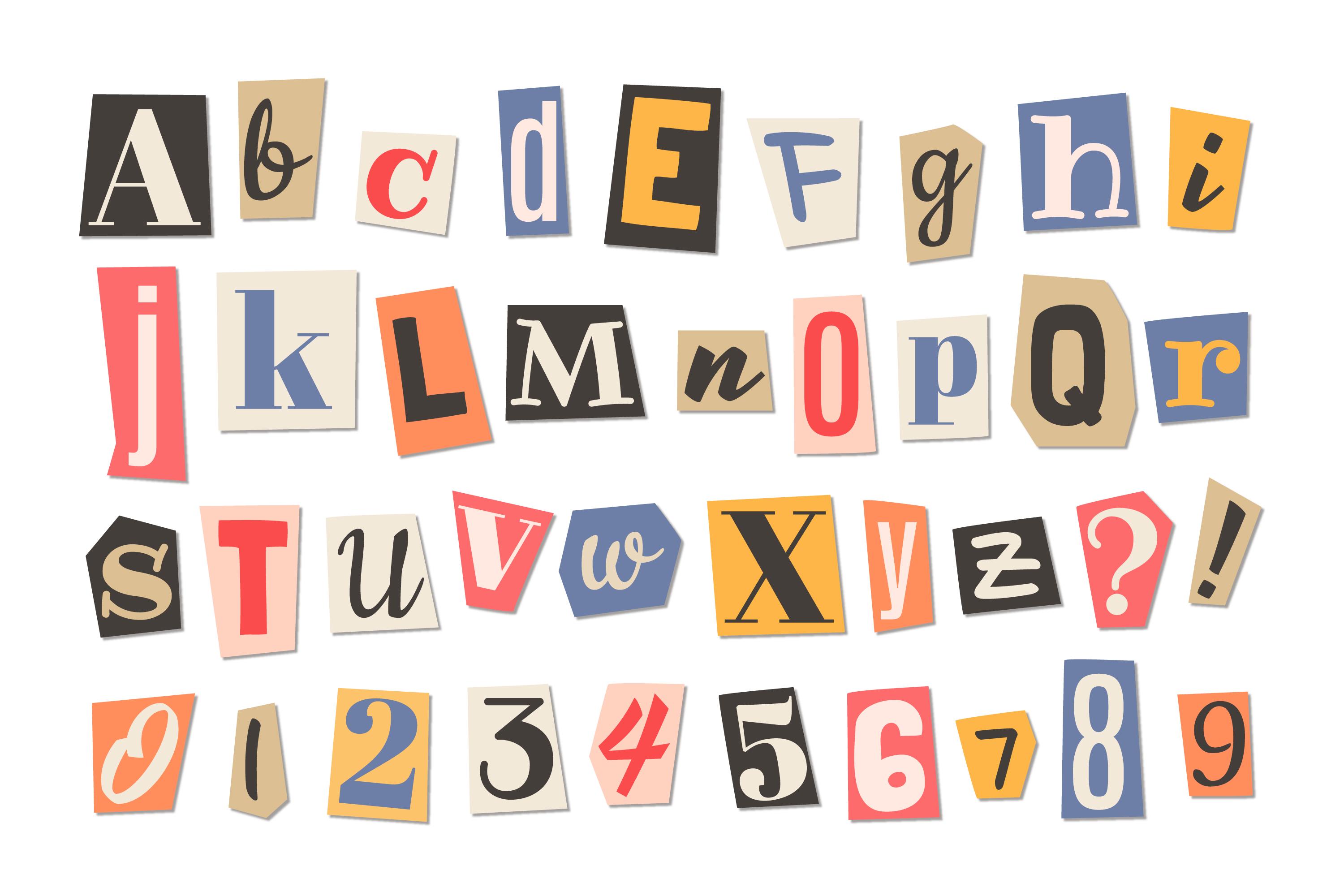
“Make it easy to read.” — Roger Black, art director
For those of us old enough to remember life before computers — yes, there really was such a time — there was the typewriter. Every document you typed looked pretty much the same. You chose your words, but you certainly didn’t spend twenty minutes deciding which font to use.
Today, we have thousands of fonts at our fingertips. That can be great. Fonts can add personality, set a mood and make even a simple parish poster or social media graphic look terrific.
The downside? Most of us aren’t graphic designers. Give us thousands of choices and it can be hard to know where to start. And sometimes we start using all of them! Take a look at enough parish bulletins and posters and sooner or later you’ll find one using five, six, or seven different fonts.
The good news is that you don’t need to know much about typography to make good choices. A few simple rules will take you a long way.
A Very Quick Font Lesson
We Catholics are probably most familiar with the baptismal font, but there is another kind of font — the kind that has to do with text.
Technically, a typeface is the overall design of a set of letters, numbers and symbols, Times New Roman or Arial, for example. A font is a particular version of that typeface, such as Times New Roman Bold Italic 12 point.
In everyday use, however, we tend to call them all fonts, and that’s perfectly fine.
Serif — traditional and classic, such as Times New Roman
Sans-serif — clean and modern, such as Arial
Script — decorative and handwritten in appearance
Display — distinctive, attention-grabbing fonts generally used for headlines
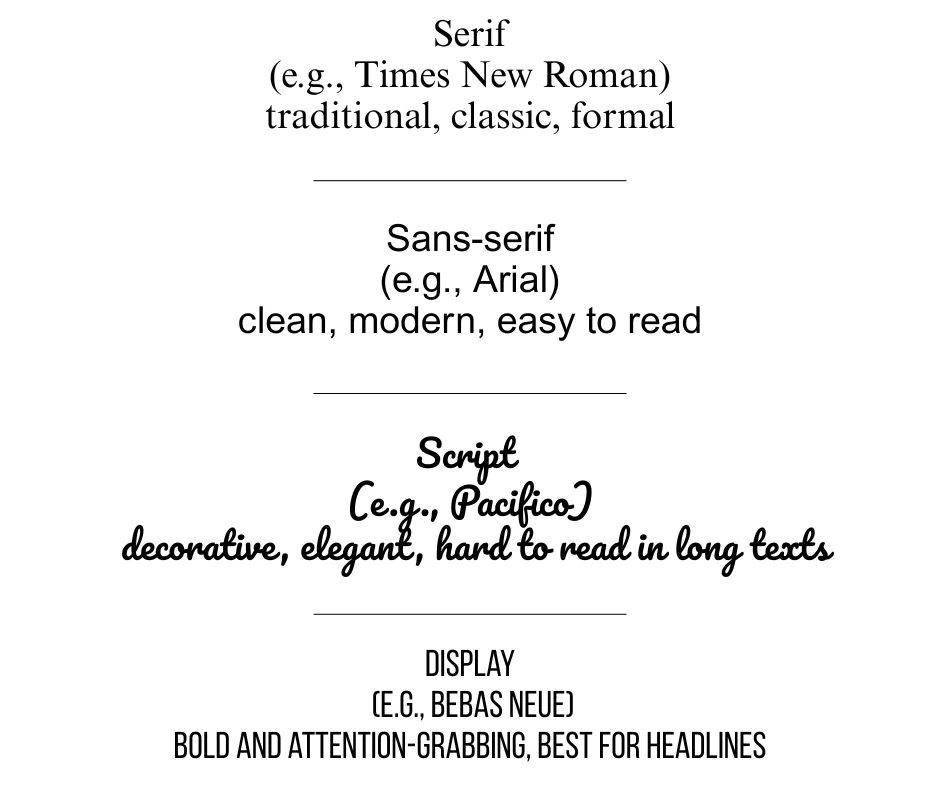
You don’t need to memorize any of this. It simply helps to know what you’re looking at when you open that enormous font menu.
The Most Important Rule: Stick to 2–3 Fonts
If you remember only one thing from this article, make it this: Don’t use more than two or three fonts in one design. Trust me, less really is more. Despite all the self-learning I’ve done in this area, I know I’m not a graphic designer. That’s exactly why I follow this rule!
Two fonts are often plenty. A third can be useful when you want a little extra personality. The easiest way to choose them is to give each font a job.
Heading Font
Your heading font can be bold and eye-catching. Its job is to grab attention and make it immediately clear what your poster, bulletin item or graphic is about.
Body Font
This one has an even more important job: people have to be able to read it. Choose something simple and clear, especially when you have more than a few words of text.
Accent Font
This one is optional. It might be a script or decorative font used for a quote, a few special words or a little visual interest. The key word here is a little.
How to Pair Fonts Without Guessing
Here’s where things can get intimidating. Which fonts actually look good together? The trick to pairing fonts is contrast with harmony. They shouldn’t look so similar that you wonder why you bothered using two fonts, but they also shouldn’t look as though they belong on two completely different posters.
Fortunately, you don’t have to figure this out from scratch. Here are five easy combinations:
Playfair Display + Lato
Montserrat + Open Sans
Bebas Neue + Roboto
Abril Fatface + Nunito
Raleway + Merriweather
In each pairing, the first works well as a heading font and the second as body text.
And if you’re using Canva, remember that its templates were created by people who understand design. If you like a template, think twice before changing all the fonts. The ones already there were probably chosen to work together.
Make It Easy to Read
This is where that Roger Black quote comes back in: “Make it easy to read.” You might fall in love with a beautiful script font. I know I do! But if people have to struggle to figure out what it says, it isn’t doing its job.
The same goes for ALL CAPS. They can work well for a short heading or a word you want to emphasize, but an entire paragraph in capital letters is hard to read. In an email, it can also look as though YOU’RE YELLING AT THE RECIPIENT.
And remember that what looks perfectly readable on your computer screen may look very different once it’s printed. If you’re creating a bulletin, poster or handout, print a test copy. You may discover that your text is much smaller, or much bigger, than you thought.
A Few Fonts I’d Be Careful With
There aren’t many fonts I’d tell you never to use. But there are a few I’d approach with caution.
Comic Sans is extremely informal — although I confess I still use it on a fun poster now and then.
Papyrus has been used so often, particularly in church circles, that it can make a design feel dated.
And then there are Curlz MT, Jokerman, and Chiller. Just... don’t.
When in doubt, simple and readable will almost always serve you better than fancy.
Want a Shortcut?
You don’t have to remember all of this. I’ve put the basic rules, font roles, five easy font pairings and a quick design checklist into a one-page Font Pairing Cheat Sheet you can keep handy when you’re working on your next parish project.
DOWNLOAD THE FREE FONT PAIRING CHEAT SHEET
Fonts may seem like a small detail, but they can make a big difference. Choose just a few, give each one a job and, above all, make it easy to read.